Material Design|材料设计
Accessibility|无障碍
Developer Docs
Implementing Accessibility
One of Android's missions is to organize the world's information and make it universally accessible and useful. Accessibility is the measure of how successfully a product can be used by people with varying abilities. Our mission applies to all users-including people with disabilities such as visual impairment, color deficiency, hearing loss, and limited dexterity.
Android其中一个使命是组织世界的信息,并让这些信息普遍可访问并且可用。无障碍是一个产品是否能被残障用户成功使用的衡量标准。我们的使命面向所有用户——包含例如视觉障碍、色觉障碍、听力损失和行动不便等残障用户。
Universal design is the practice of making products that are inherently accessible to all users, regardless of ability. The Android design patterns were created in accordance with universal design principles, and following them will help your app meet basic usability standards. Adhering to universal design and enabling Android's accessibility tools will make your app as accessible as possible.
通用设计是一个实践,是让产品在根本上对所有用户无障碍,且于用户能力如何无关。Android设计部分是依据通用设计原理创建的,遵循这些原理可以让应用满足基本可用性标准。符合通用设计并使用Android无障碍工具将会使应用尽可能无障碍。
Robust support for accessibility will increase your app's user base. It may also be required for adoption by some organizations.
无障碍特性的鲁棒性支持将会增加应用的用户基础。这可能是某些组织采用所必须的。
Learn more about Google and accessibility.
Android's Accessibility Tools|Android无障碍工具
Android includes several features that support access for users with visual impairments; they don't require drastic visual changes to your app.
Android包含几个支持视觉障碍用户访问的特性;他们不需要应用做出巨大的视觉改变。
- TalkBack is a pre-installed screen reader service provided by Google. It uses spoken feedback to describe the results of actions such as launching an app, and events such as notifications.
TalkBack是由Google公司提供的一个预安装屏幕阅读服务。它使用语音反馈描述操作的结果(如启动一个app)和事件(如通知)。
- Explore by Touch is a system feature that works with TalkBack, allowing you to touch your device's screen and hear what's under your finger via spoken feedback. This feature is helpful to users with low vision.
Explore by Touch(触摸浏览) 是与TalkBack协作的系统特性,允许用户触摸设备屏幕并通过语音反馈听取手指触摸的内容。该特性对低视力用户有帮助。
- Accessibility settings let you modify your device's display and sound options, such as increasing the text size, changing the speed at which text is spoken, and more.
无障碍设置 允许用户修改设备的展示和声音选择,例如放大文本字体,改变文本阅读的速度等等。
Some users use hardware or software directional controllers (such as a D-pad, trackball, keyboard) to jump from selection to selection on a screen. They interact with the structure of your app in a linear fashion, similar to 4-way remote control navigation on a television.
一些用户使用硬件或软件定向控制(例如,D-pad,轨迹球,键盘)从屏幕上的一个选择跳转到另一个选择。他们以线性顺序与应用的结构进行交互,这种线性顺序类似于电视的四个方向远程控制导航。
Guidelines|指南
The Android design principle "I should always know where I am" is key for accessibility concerns. As a user navigates through an application, they need feedback and a mental model of where they are. All users benefit from a strong sense of information hierarchy and an architecture that makes sense. Most users benefit from visual and haptic feedback during their navigation (such as labels, colors, icons, touch feedback) Low vision users benefit from explicit verbal descriptions and large visuals with high contrast.
Android 设计原则“我总是知道我在哪”是无障碍性的关键。当用户在应用中导航时,他们需要当前位置的反馈和心里模型。所有用户都会得益于信息层次和结构传递的信息。大多数用户在导航时得益于视觉和触觉反馈(例如,标签、颜色、图标、触摸反馈)。低视力用户得益于详细的词汇描述和高对比度大视觉呈现。
As you design your app, think about the labels and notations needed to navigate your app by sound. When using Explore by Touch, the user enables an invisible but audible layer of structure in your application. Like any other aspect of app design, this structure can be simple, elegant, and robust. The following are Android's recommended guidelines to enable effective navigation for all users.
设计应用时,请认真考虑在语音导航应用时需要的标签和提示。当使用 Explore by Touch(触摸浏览)时,用户能够使用应用中非视觉的语音布局结构。像应用设计的任何其他方面,该结构应当简洁、文雅、兼容。以下是Android推荐指南,遵循这些指南可以让所有用户的导航有效。
Make navigation intuitive|使导航符合直觉
Design well-defined, clear task flows with minimal navigation steps, especially for major user tasks. Make sure those tasks are navigable via focus controls.
设计一个清晰且明确的任务流程,使用最少的导航步骤,尤其是对于主要用户任务。保证这些任务都能通过焦点控件进行导航。
Use recommended touch target sizes|使用推荐的触摸目标大小
48 dp is the recommended touch target size for on screen elements. Read about Android Metrics and Grids to learn about implementation strategies to help most of your users. For certain users, it may be appropriate to use larger touch targets. An example of this is educational apps, where buttons larger than the minimum recommendations are appropriate for children with developing motor skills and people with manual dexterity challenges.
48 dp 是屏幕元素推荐的触摸目标大小。查看Android的规则与网格了解如何实现这些方法来帮助大部分用户。对于特定的用户,可能需要使用更大一些的目标控件。例如对于教育应用,与推荐的最小控件相比,更大的控件更适合开发运动技巧的儿童或者精细动作障碍人士使用。
Label visual UI elements meaningfully|视觉UI元素的标签要有意义
在做设计时,标记功能UI组件 这些组件没有视觉文本。这些组件可能是按钮、图标、图标tabs、状态图标(例如星级)。开发者可以使用contentDescription属性设置标签。
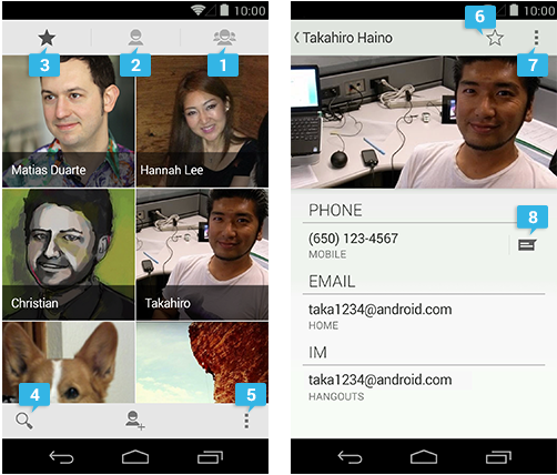
- 群组(group)
- 所有联系人(all contacts)
- 收藏夹(favorites)
- 搜索(search)
- 更多操作按钮(action overflow button)
-
当选中:从收藏夹移除
当未选中:加入收藏夹 - 更多操作按钮(action overflow button)
- 文本信息
Provide alternatives to affordances that time out|为即时消失的控件提供替代启示
Your app may have icons or controls that disappear after a certain amount of time. For example, five seconds after starting a video, playback controls may fade from the screen.
App可能会有在一段时间之后消失的图标和控件。例如,打开视频后5秒钟,播放按钮会在屏幕上消失。
Due to the way that TalkBack works, those controls are not read out loud unless they are focused on. If they fade out from the screen quickly, your user may not even be aware that they are available. Therefore, make sure that you are not relying on timed out controls for high priority task flows. (This is a good universal design guideline too.) If the controls enable an important function, make sure that the user can turn on the controls again and/or their function is duplicated elsewhere. You can also change the behavior of your app when accessibility services are turned on. Your developer may be able to make sure that timed-out controls won't disappear.
根据talkback的工作方式,这些控件只有当聚焦的时候才会被朗读出来。如果它们很快地从屏幕上消失,用户可能根本就不知道这些控件的存在。因此,保证重要功能不可以使用即时消失控件。(这也是一个通用设计原则。)如果控件连接着重要功能,保证用户可以再次打开该控件,或该功能在其他处可获得。当无障碍服务打开时,可以改变app的行为。开发者可能能够确保即时消失的控件不会消失。
Use standard framework controls or enable TalkBack for custom controls|使用标准的开发框架控件或者让自定义控件支持 TalkBack
Standard Android framework controls work automatically with accessibility services and have ContentDescriptions built in by default.
标准Android 开发框架控件自动支持无障碍服务,并且默认包含了 ContentDescriptions 属性。
An oft-overlooked system control is font size. Users can turn on a system-wide large font size in Settings; using the default system font size in your application will enable the user's preferences in your app as well. To enable system font size in your app, mark text and their associated containers to be measured in scale pixels.
一个被经常忽视的系统控件是字体大小。用户可以在设置中打开一个全系统的大字体。在app中使用系统默认的字体,将会在应用中保留用户的偏好设置;为了在app中使用系统字体大小,标记文本和相关联的容器应使用scale pixels来度量。
Also, keep in mind that when users have large fonts enabled or speak a different language than you, their type might be larger than the space you've allotted for it. Read Devices and Displays and Supporting Multiple Screens for design strategies.
另外,记住当用户使用大字体或者使用与开发者不同的语言时,它们使用的容器可能会比开发者分配的空间大。设备和显示和支持多屏显示的设计策略。
If you use custom controls, Android has the developer tools in place to allow adherence to the above guidelines and provide meaningful descriptions about the UI. Provide adequate notation on your wireframes and direct your developer to the Custom Views documentation.
如果使用自定义控件,安卓有开发工具来让自定义控件符合以上的原则,并提供有效的UI描述。在框架中提供足够的注释,指导开发者来自定义视图文档。
Try it out yourself|亲自试试
Turn on the TalkBack service in Settings > Accessibility and navigate your application using directional controls or eyes-free navigation.
在设置>无障碍中打开TalkBack服务,然后使用定向或非视觉导航应用。
Checklist|检测表
- Make navigation intuitive|使导航符合直觉
- Use recommended touch target sizes|使用推荐的触摸目标大小
- Label visual UI elements meaningfully|视觉UI元素的标签有意义
- Provide alternatives to affordances that time out| 为即时消失元素提供替代启示
- Use standard framework controls or enable TalkBack for custom controls|使用标准框架控件或使自定义控件TalkBack可用
- Try it out yourself亲自试试